
Southwest Airlines Task Redesign | Improving Airport Wayfinding
Timeline: 3 weeks
Role: Sole designer and researcher
Tools: Figma, Adobe Illustrator, Adobe Photoshop
Role: Sole designer and researcher
Tools: Figma, Adobe Illustrator, Adobe Photoshop
Skills: UX/UI Design, UX Research, User Journey Mapping, User Flows, Content Mapping, Copywriting, Wireframing, Visual Design, Graphic Design
Traveling is stressful enough without the added confusion of navigating an unfamiliar airport. While airline apps like Southwest’s provide essential flight information, they fall short in helping passengers navigate the airport itself. In this redesign project, I aimed to improve the wayfinding experience in the Southwest Airlines app, enabling users to more easily navigate the airport before their flight.
Problem Statement:
How might we improve the wayfinding experience within the Southwest Airlines app and better assist passengers with the steps leading up to their flight?
UX Research Insights:
To gain a better understanding of user needs and overall performance of the Southwest Airlines App, I conducted in-depth research using the following methods:
Method #1 - Content Mapping - Identifying Patterns
I explored the Southwest Airlines app to assess its structure and identify gaps in supporting passengers with airport navigation. My observations included:
- Much of the app’s content was focused on marketing, not directly related to airport navigation or pre-flight tasks
- Important information, such as wayfinding maps, was hidden behind outdated web pages or deeply buried menus
- The app’s navigation hierarchy was not intuitive, and key information (e.g., flight details) was buried in a small top bar, making it hard for users to find quickly
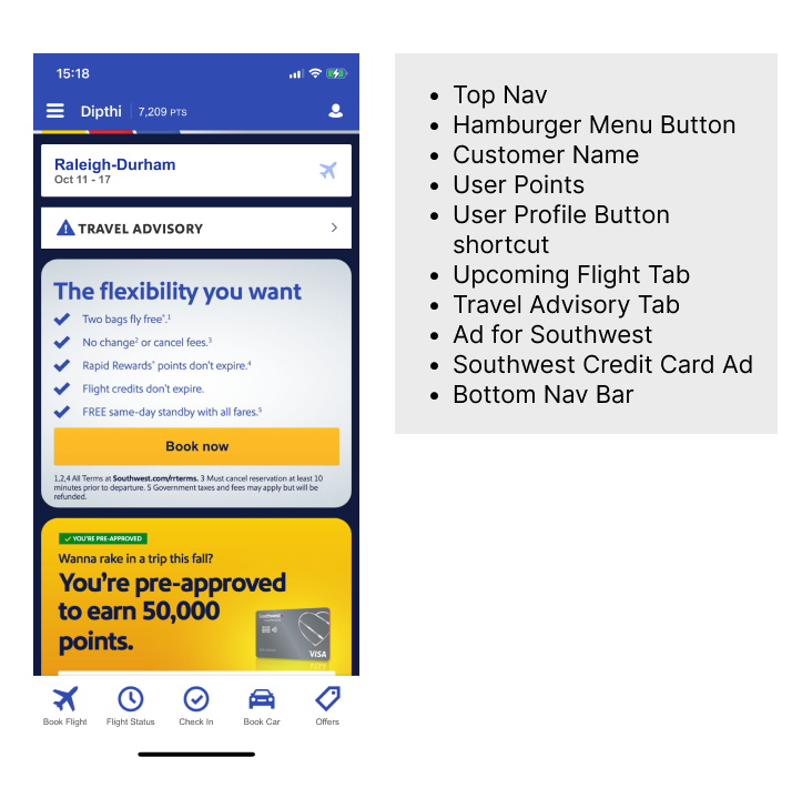
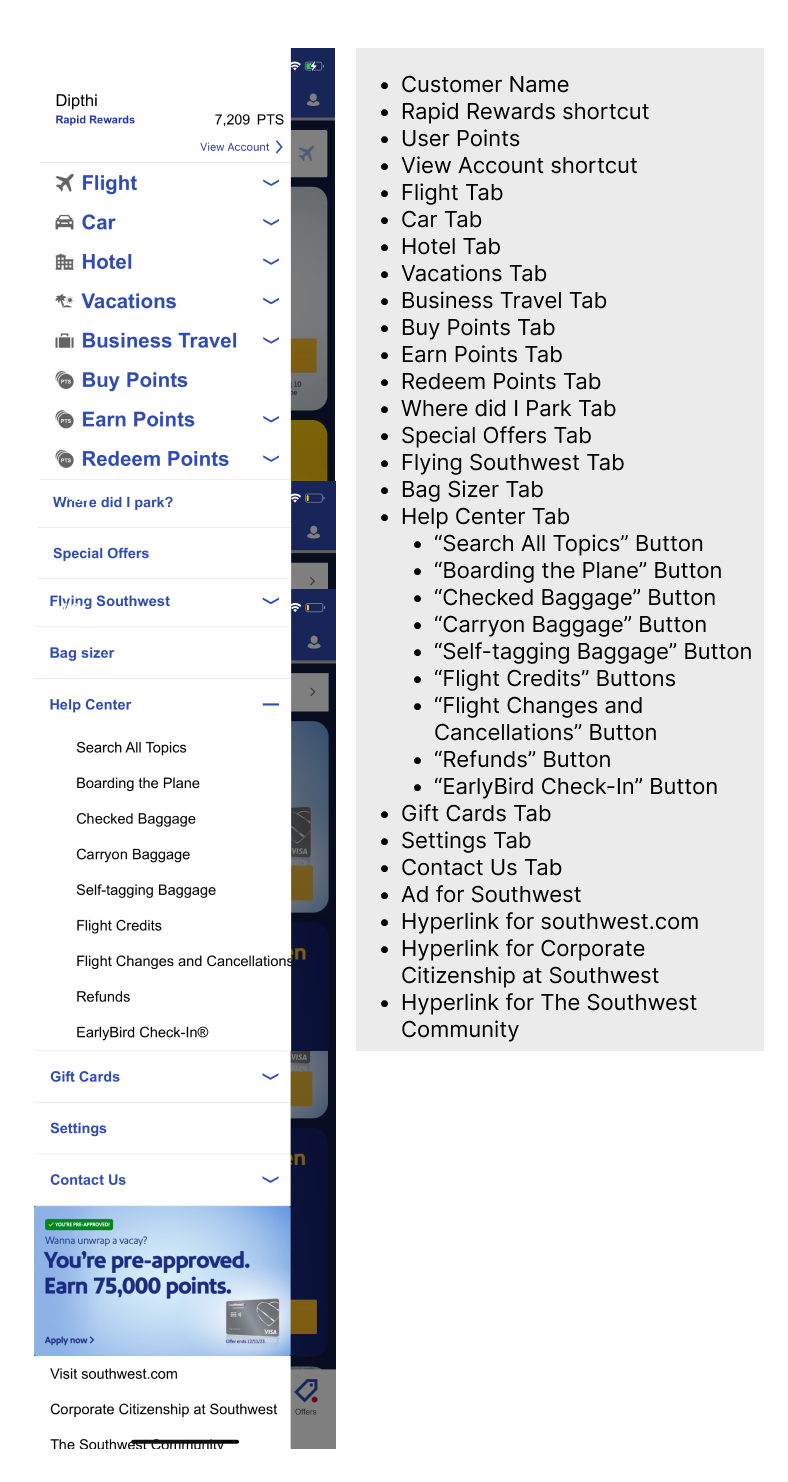
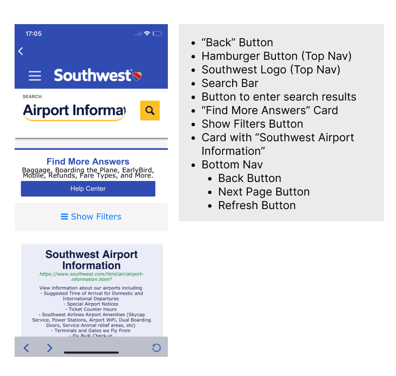
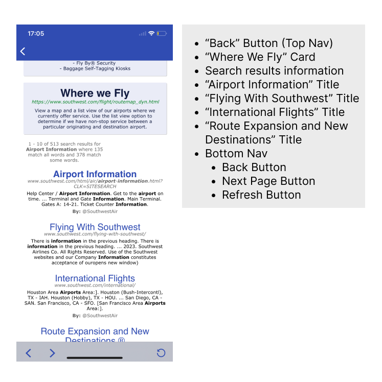
*please click on the arrows to navigate between the content maps
Method #2 - User Journey Mapping - Understanding the User’s PerspectiveNext, I mapped the user journey from the perspective of a typical Southwest Airlines passenger. By focusing on the “pain points,” “thoughts,” and “feelings” during each stage of the journey, I was able to prioritize critical user needs.

Key insights from this process included:
Users want as much information as possible
The more information they receive early in the process, the better they feel prepared and in controlUsers need this information as early as it can be provided
Users crave clear, early information to reduce stress and make decisions quicklyVisual Hierarchy Helps
Visual hierarchy (e.g., color, typography) plays a crucial role in making information digestible and reducing confusion during stressful momentsThe Design Solution - A Virtual Walkthrough Assistant:
Based on the insights from my research, I proposed a Virtual Walkthrough Assistant integrated within the Southwest Airlines app. The assistant would guide passengers through the pre-flight experience, helping them manage tasks such as checking in, accessing boarding passes, and navigating the airport. The key features included:
- Interactive Pop-up Cards:
These cards would deliver step-by-step instructions to users at key points in their journey (e.g., check-in, baggage, security) - Customized Information: Each card would provide information tailored to the user’s specific flight details, tasks completed, and progress in the airport navigation process
- Opt-in/Opt-out Functionality: Users could choose whether to engage with the assistant at any time, and they could easily access it again using a dedicated icon.


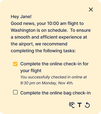

*please click on the arrows to navigate between the cards
Wireframes & User Flows:
The virtual assistant would guide users through several key stages of the airport experience:
Flow #1 - Pre Check-In
Prior to checking in, the assistant would prompt users to complete intial steps, like checking in online & preparing baggage. Once the user completed these tasks, the assistant would guide them to their digital boarding pass.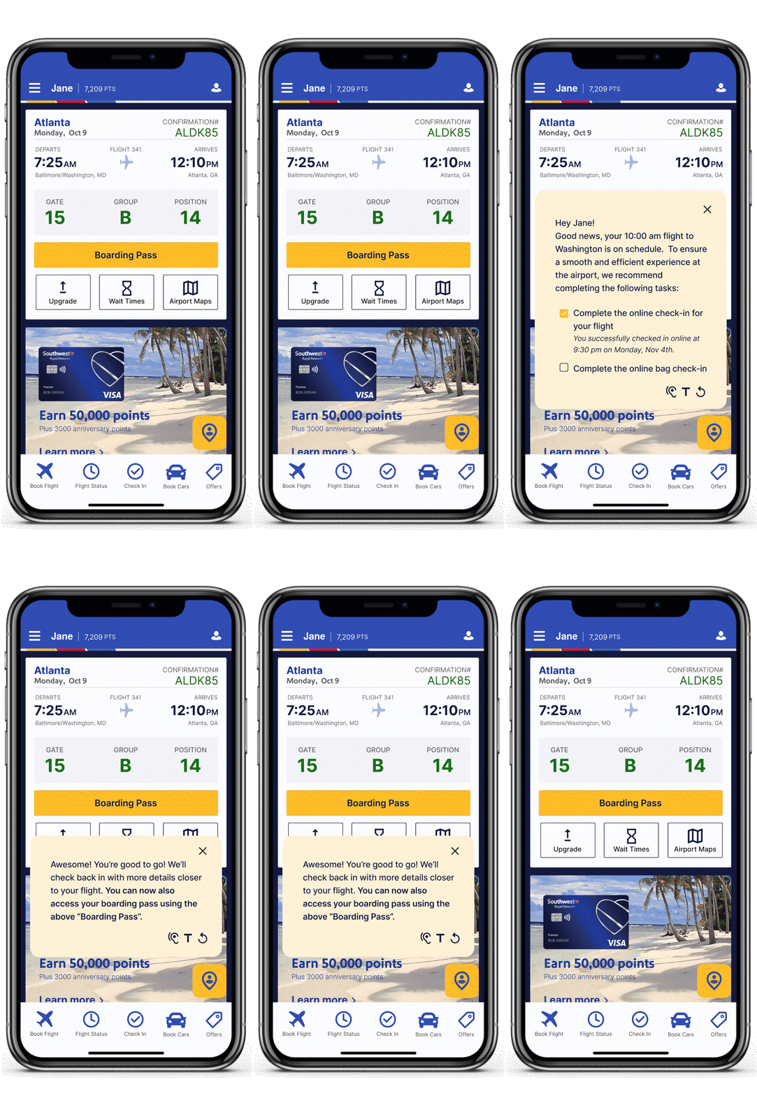
Flow #2 - Accessing Boarding Pass & Wayfinding
After check-in, users would access their digital boarding pass and a wayfinding feature. This would allow them to familiarize themselves with the airport layout, even before they arrived, reducing stress upon arrival.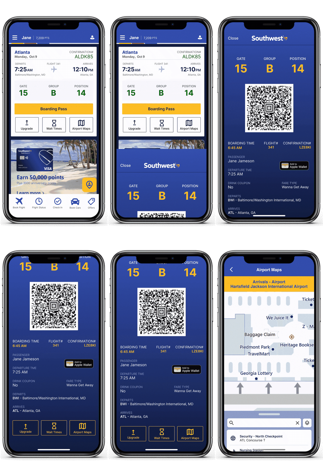
Flow #3 - Baggage Check or Security
Once at the airport, the assistant would help users navigate key steps: whether it’s checking in baggage or heading to security. The assistant would provide clear instructions for these processes based on the user’s status.
Flow #4 - Gate Navigation
After security, the assistant would guide users to their gate, using the airport wayfinding map. This map would not only show the user's proximity to the gate but also provide live updates, such as wait times and walking distances.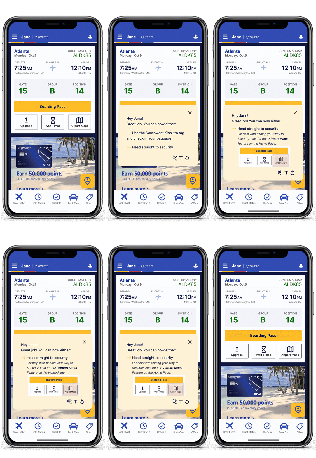
Future Considerations:
Short-Term Goals:
- Enhance the wayfinding experience by incorporating intra-airport transport (e.g., trains, buses) and cardinal directions
- Investigate ways to display multi-level airport maps
Long-Term UX Considerations:
- Explore how AR/VR could enhance the walkthrough experience
- Assess potential mental health benefits by reducing travel-related anxiety
 ™
™